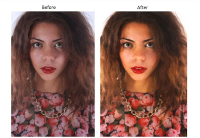
After looking through the images taken from my photo-shoot, I decided to use this image. I feel that is an extremely effective photo as my models hair is big and wild which connotes youth and fun - which is strongly associated with my target audience and the genre of music that my magazine is based on. The bright lipstick on my model's face draws attention to her lips - emphasising the vocal aspects of music and drawing the reader in. I think the close up angle works well as it allows the reader to engage with her as they feel as if they are exchanging eye contact with her. Her flowery top furthur connotes the 'indie' audience base my audience aims to appeal to, as it can be seen as a popular pattern in that grouping.
I used Adobe Photoshop to edit the photo in order to make it look more professional and appealing. I wanted to get rid of the dull/grey effect that the original photo had, in order to make it look more joyful and pleasing to the eye. In order to do this I played with the saturation and the brightness until I was satisfied with the appearance. I also wanted to get rid of the shadows and dark marks on her face, therefore I used the patch tool to lighten these parts. I also used Surface Blur in order to smooth out the image and improve how professional it looked.
Here is a video created using Cam Studio to show the different effects that I used to edit the photo.
No comments:
Post a Comment